Onebit Website Redesign
Redesigned the SaaS website to drive higher adoption and increase onboarding
OVERVIEW
I was a part of a team of two other designers, to help improve the web platform experience and push the product to the next level.
I was a part of a team of two other designers, to help improve the web platform experience and push the product to the next level.
DATES
April 2020 - 3 Week Sprint
ROLE
Lead UX Designer
User Researcher
Visual Designer
April 2020 - 3 Week Sprint
ROLE
Lead UX Designer
User Researcher
Visual Designer
TEAM
David Robles, Lead UX Designer
Stephanie Ro, Project Manager
Paul Chi, UX Researcher
Zhenyu Zhou, Data Science
Sean Lee, Strategy
Omar Hernadez, Founder
David Robles, Lead UX Designer
Stephanie Ro, Project Manager
Paul Chi, UX Researcher
Zhenyu Zhou, Data Science
Sean Lee, Strategy
Omar Hernadez, Founder
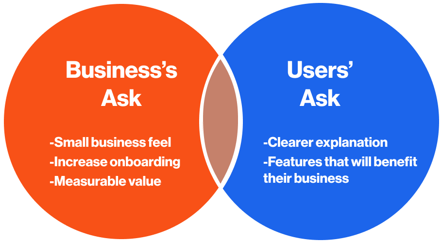
A Collaborative Process
I worked within a cross-functional team of 5. As the lead UX Designer, I designed the experience end to end, with metric analytics, business values evaluation and idea validation.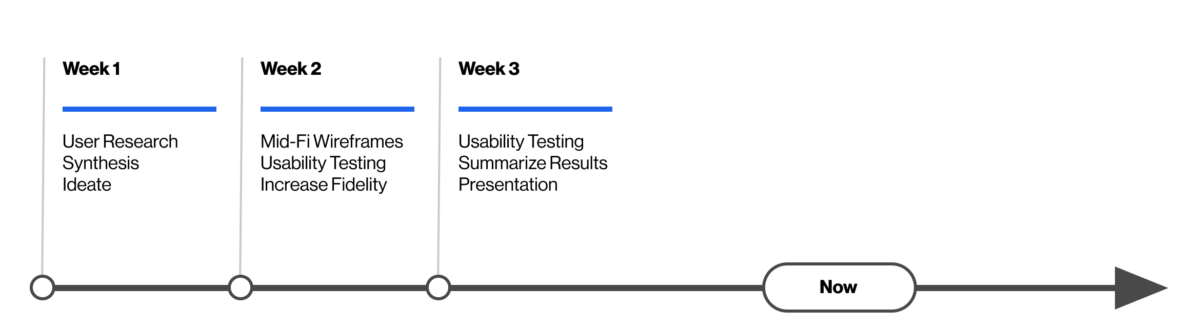
Our goal was to increase sign up rate
Hurdles throughout the project
Hurdles throughout the project
CHALLENGE #1
Low onboarding
Increasing the sign up rate was our first and main business ask.CHALLENGE #2
Product confusion
We found that the UX writing on the current site was confusing and unclear.
Product confusion
We found that the UX writing on the current site was confusing and unclear.CHALLENGE #3
Examples
In its current state, Onebit’s software and services aren’t available. I was provided with a couple of examples on some of the dashboard features.
APPROACH
Find the cause of low onboarding through evaluation on UX and research
To better understand the existing design, I wanted to do my own research on the website’s current state. I decided to do usability tests on Onebit’s site as well as interview 10 target users.
Find the cause of low onboarding through evaluation on UX and research
To better understand the existing design, I wanted to do my own research on the website’s current state. I decided to do usability tests on Onebit’s site as well as interview 10 target users.
APPROACH
Results from usability tests on current website
100%
of users were confused about product services6
PartcipantsAPPROACH
Validate ideas and iterate early, often and fast with time given
The entire process was agile and fast. Within the three weeks, it was a priority to create multiple prototypes and test them. Testing our iterations allowed us to validate ideas, learn feedback, and pivot.

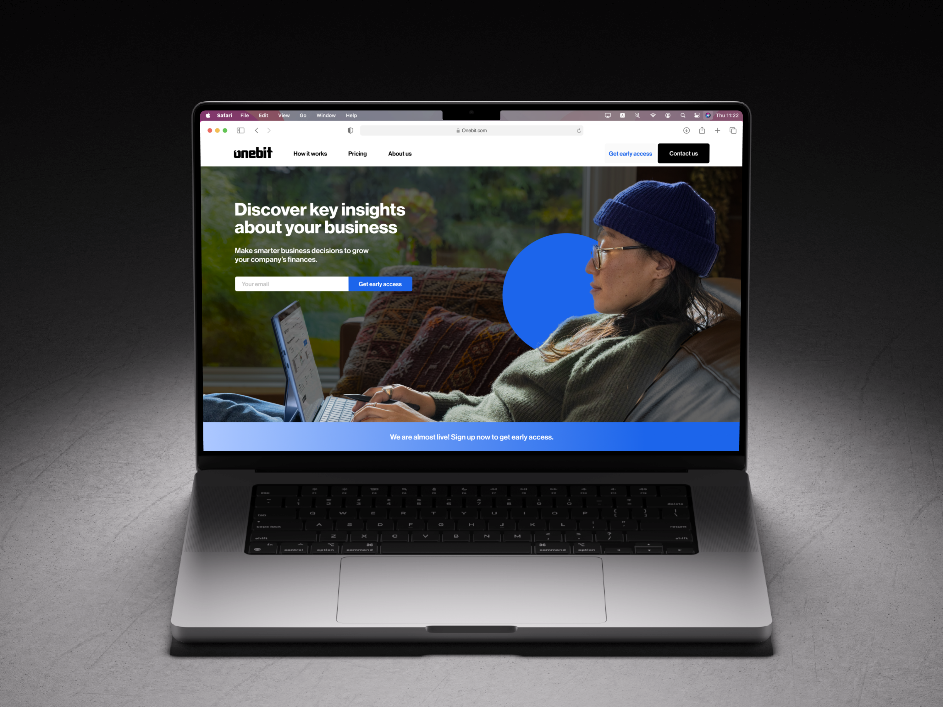
REIMAGINE FLIP
Design a website
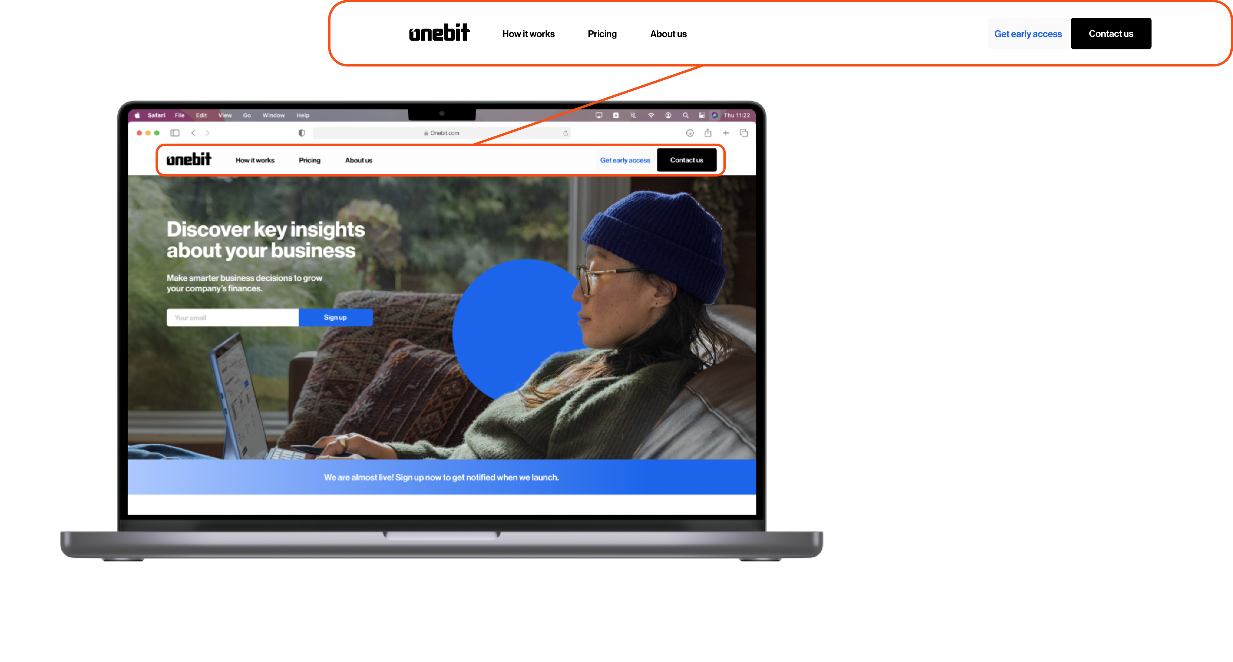
The purpose of the new design was to ensure that users know about the product's features, as well as to fix some of the issues identified early on based on the UX evaluation.
CORE CHANGES
Understanding the purpose
We revamped the UX writing, making it clear to users why they need Onebit's services.
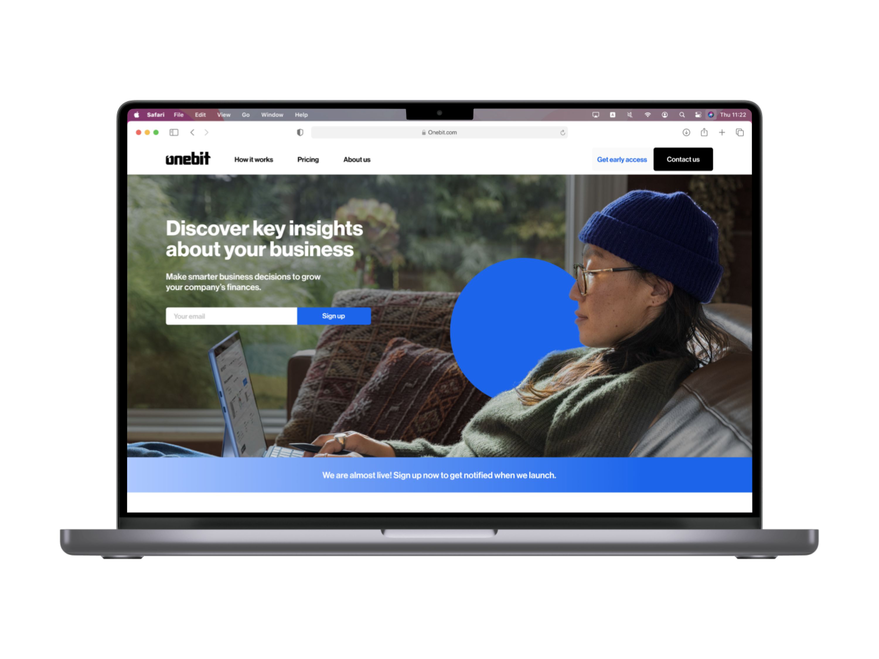
Navigation
We wanted the website to be accessible and usable. Changing the information architecture gives users confidence in where they are and what information they can receive.
Design layout and imagery for target users![]()
‘
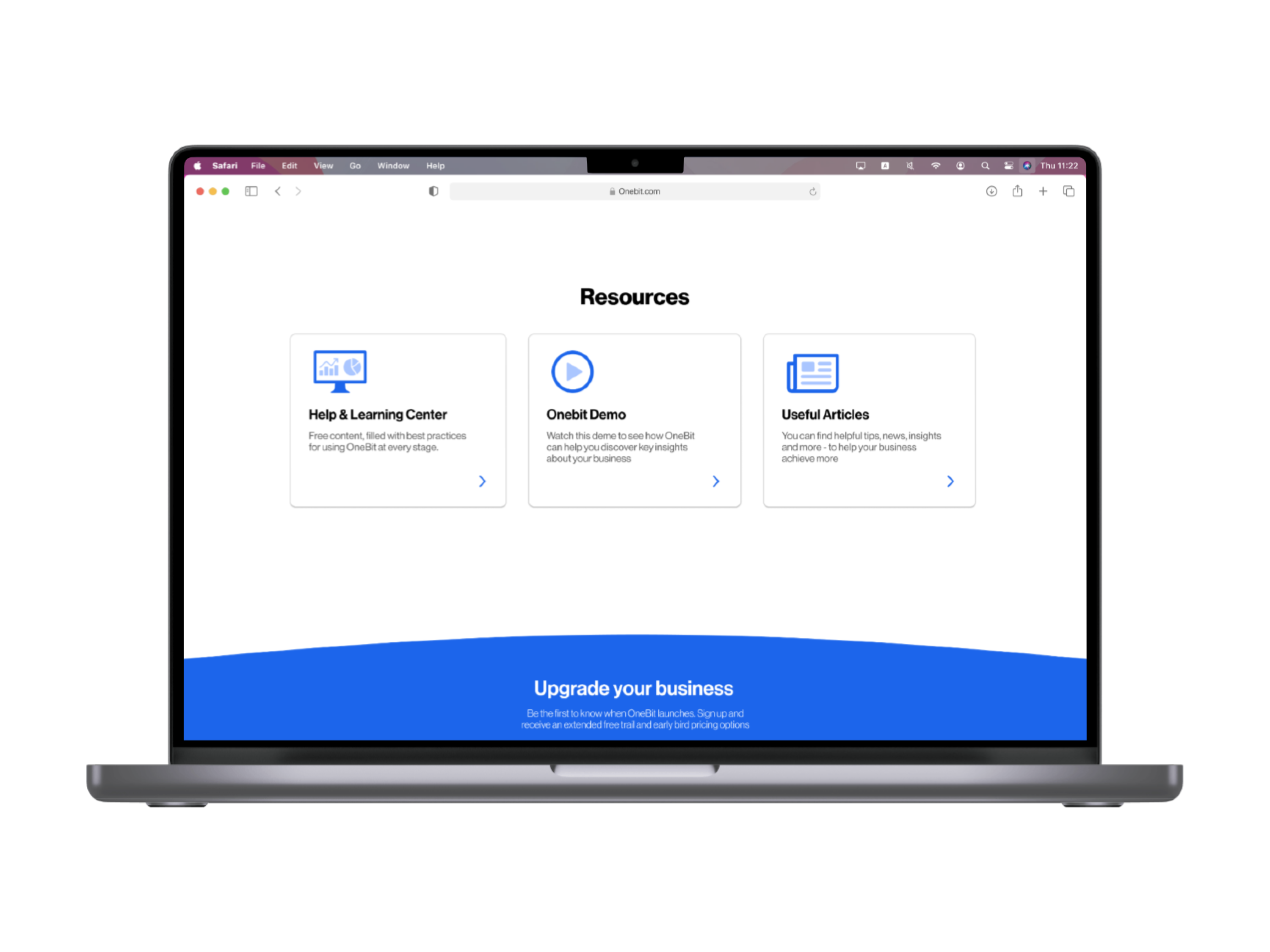
Resources
Users can learn more about growing their business. Creating a blog page came up in ideation and was something Omar was already thinking about adding.
Results
KEY TAKEAWAYSExperimenting and test - so we can fail fast and iterate
Iterating was so important for us. After learning our users' frustrations, we focused a lot on explaining the product's services. We learned that our second iteration seemed too real. As if the service was live and available. We learned this by testing which allowed us to pivot and make necessary chances.